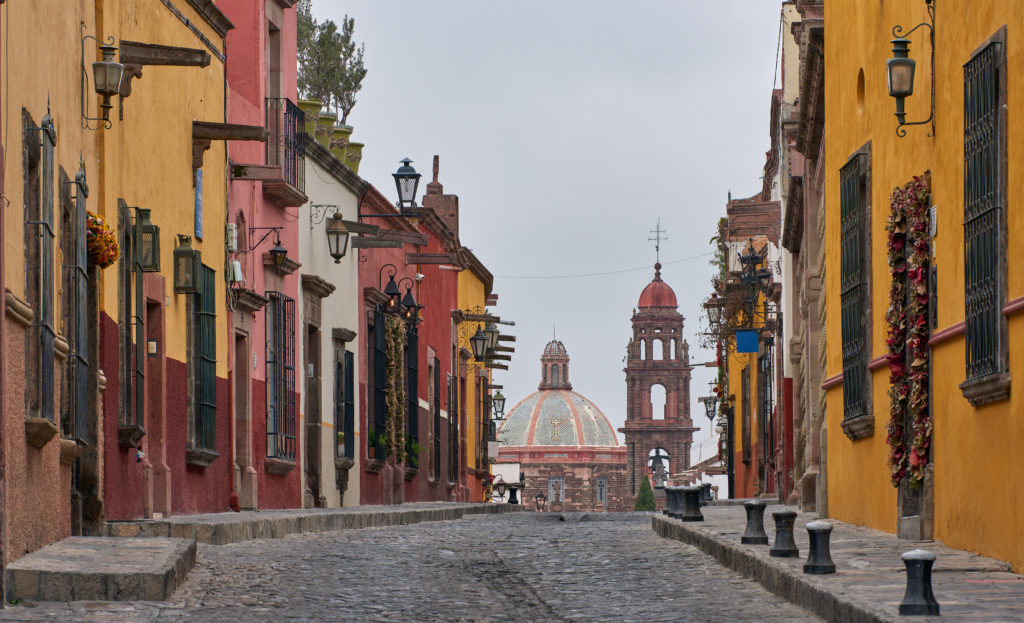
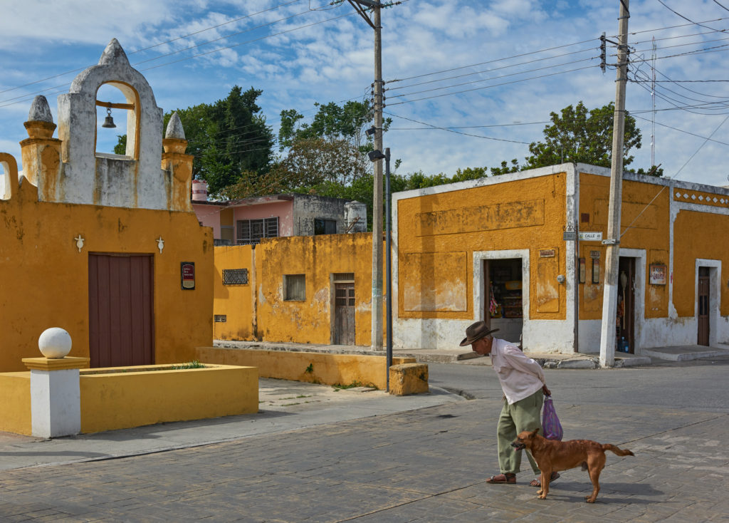
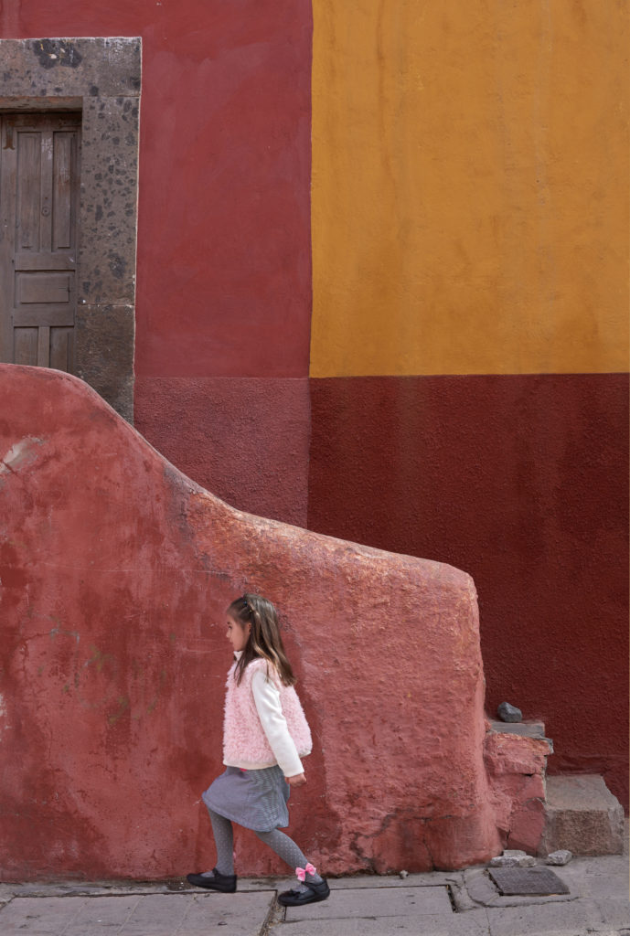
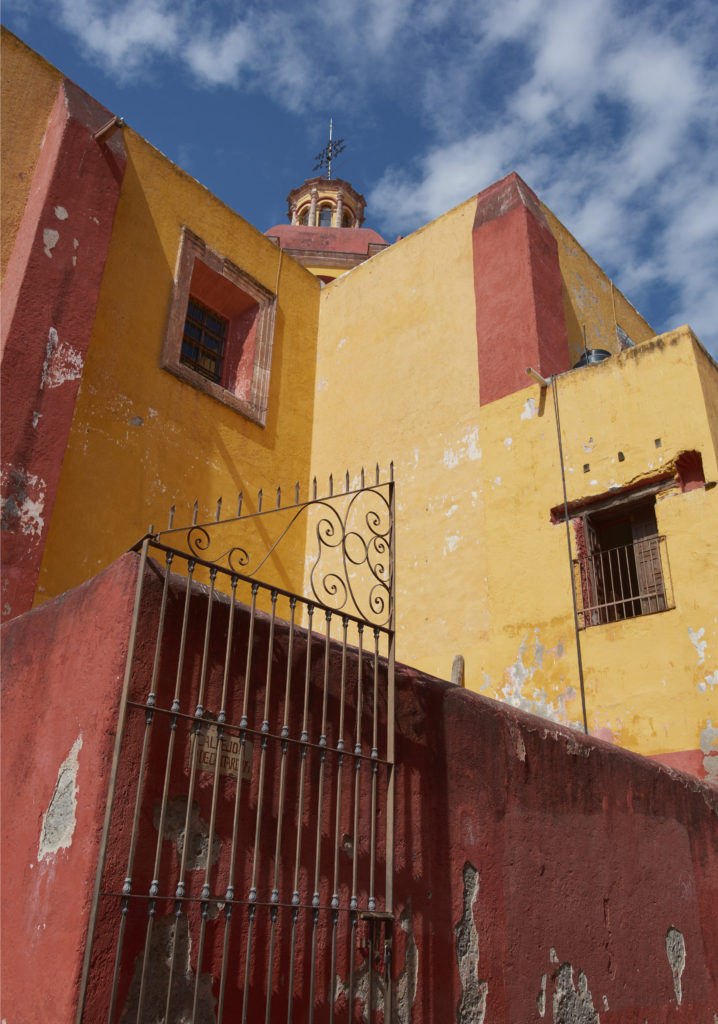
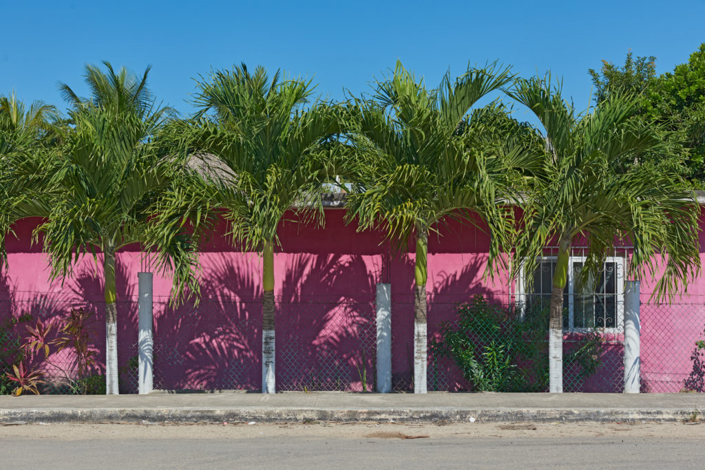
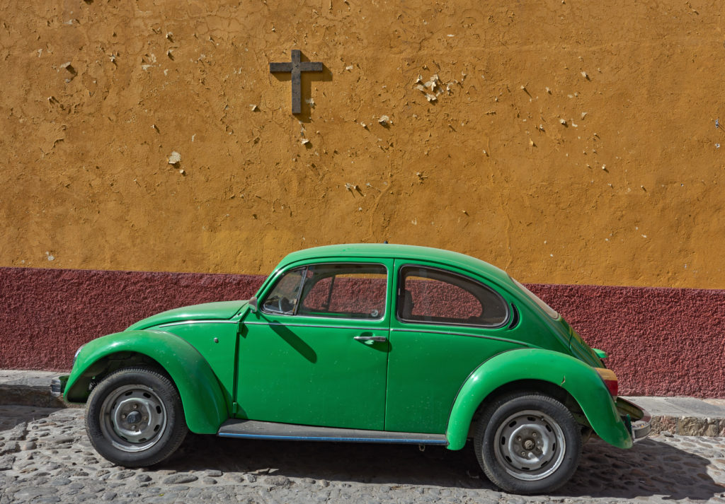
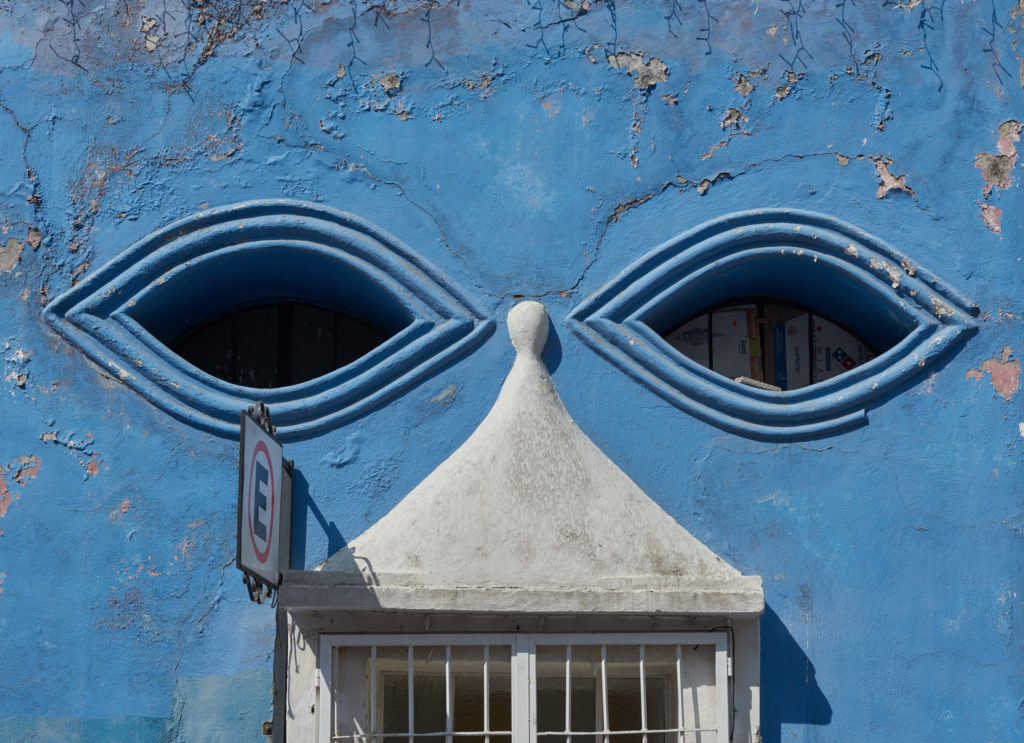
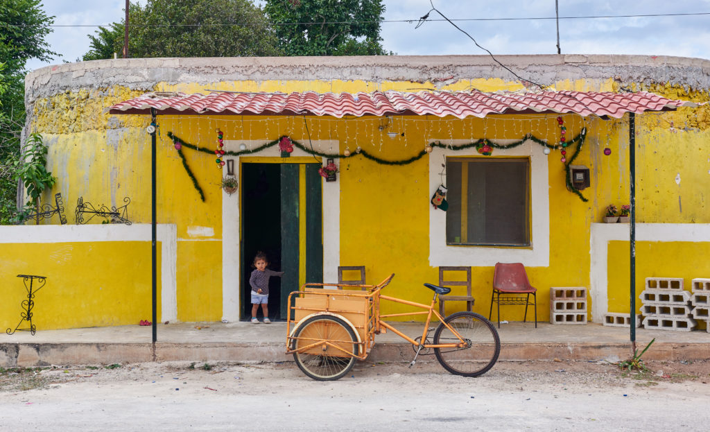
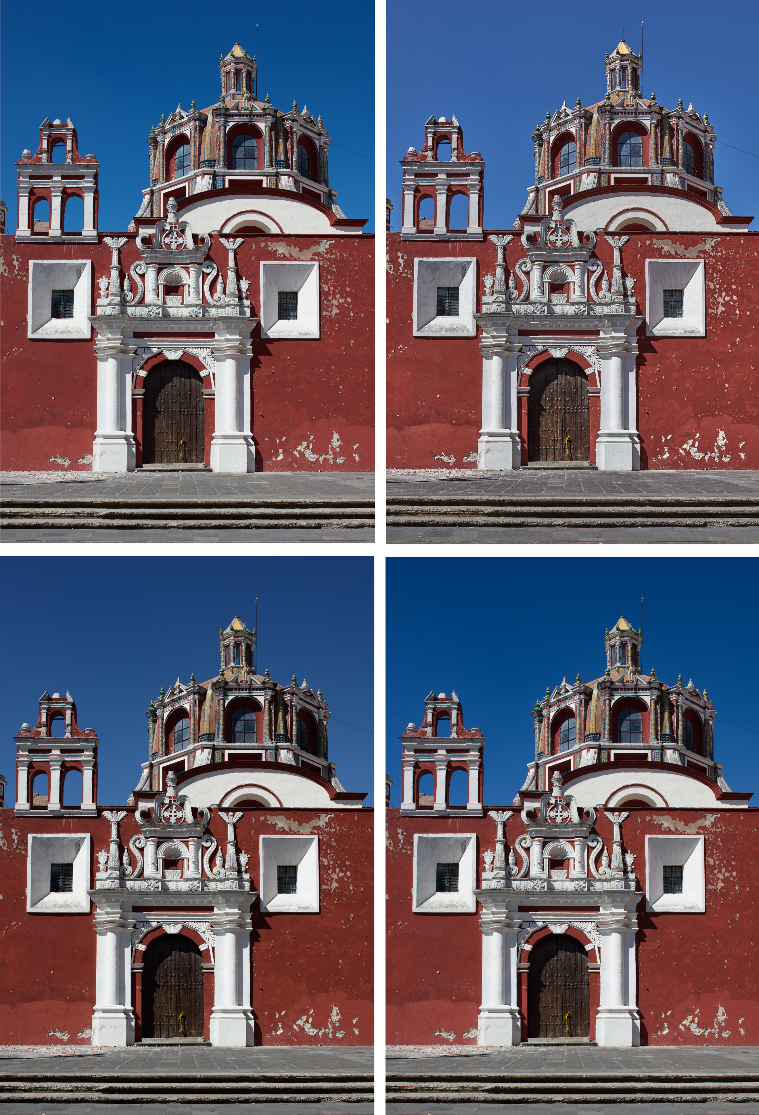
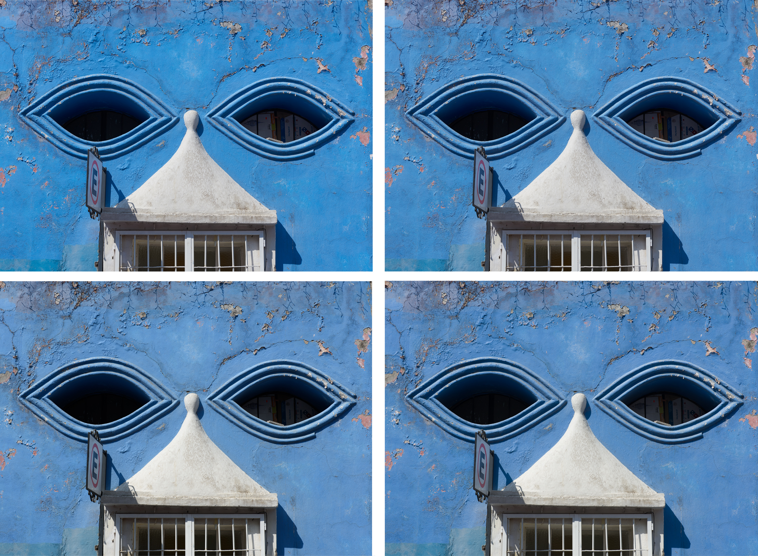
On a recent trip to the colonial cities around Mexico City and on the Yucatan peninsula, I was blown away by the colors in the cities and villages. In Europe, nobody would paint a house in saturated pink, blue, or orange, and in most places, this is even forbidden*.
Mexican culture, in general, is bursting with color, from vivid-colored textiles and folk art to buildings in a large color palette. But it wouldn’t fit if I simply posted some colorful images of a recent trip. There is almost always a technical aspect to discuss. This time, it’s the oversaturated colors due to wrong camera calibration and/or RAW converters serving the demand for vivid-looking images.
I always had the impression that RAW files processed with Capture One (the older versions) looked “better” than those processed in Lightroom, even when touching none of the custom settings. Capture One provides canned color profiles for a large number of cameras, so one would expect a starting point close to reality.
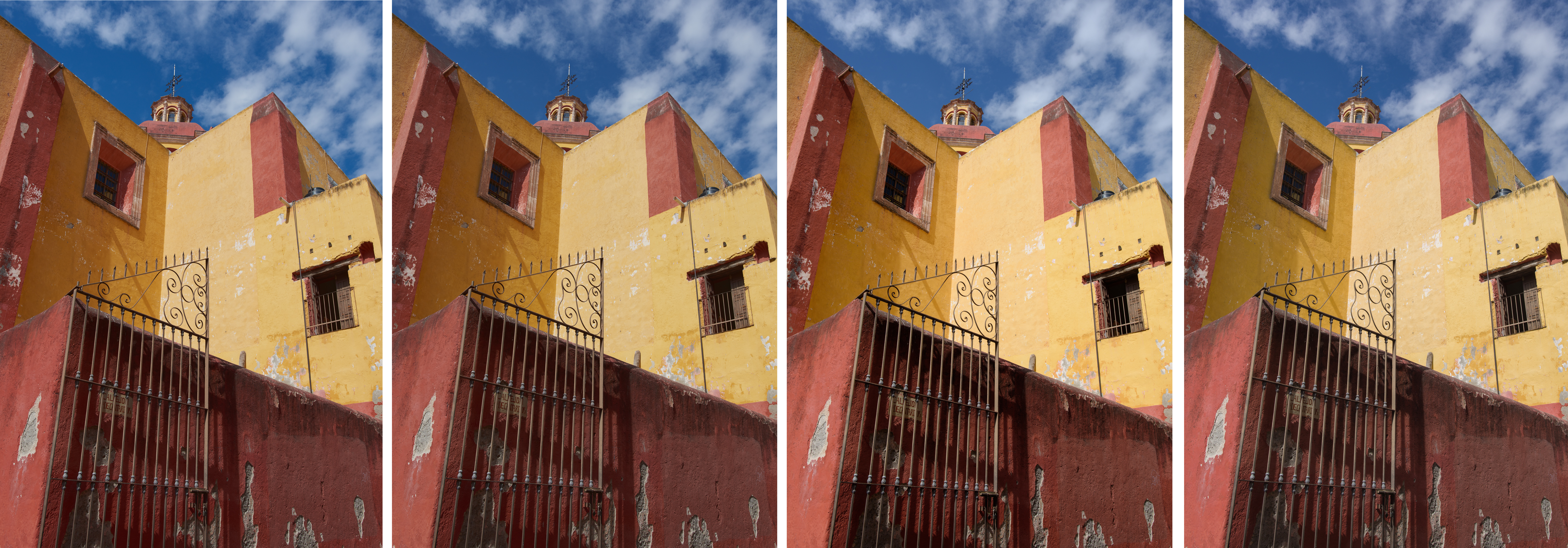
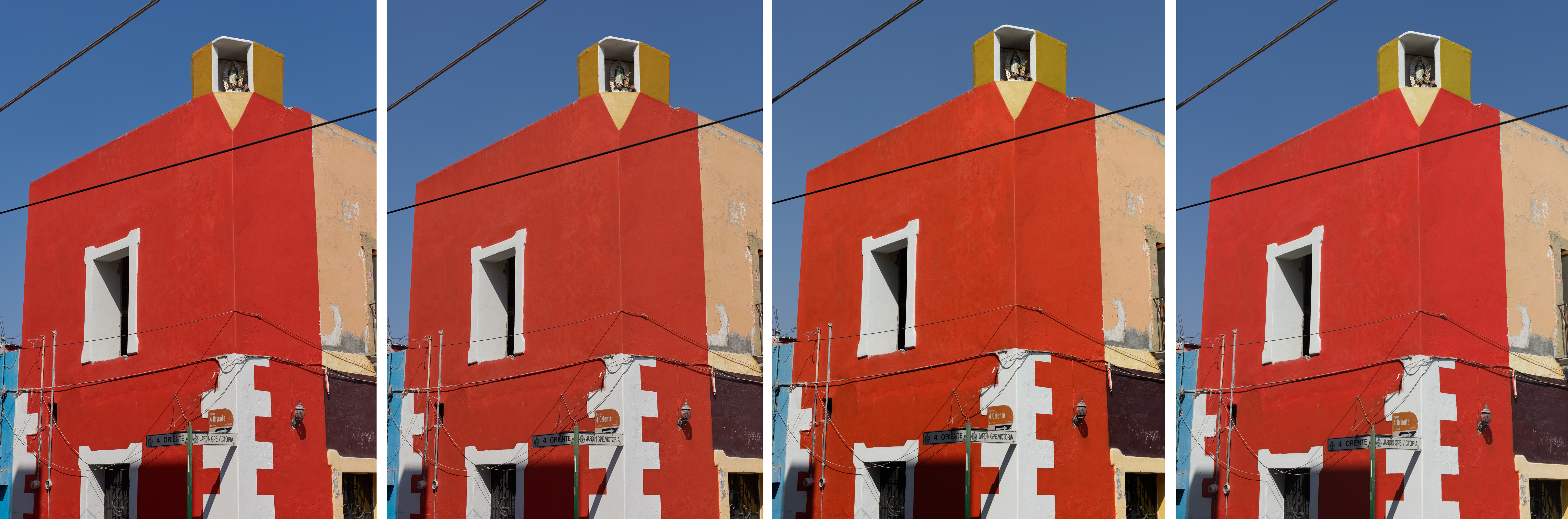
After processing my Mexico images in Capture One Pro 11 (to which I had to upgrade after changing my operation system to Mac OS High Sierra**), I didn’t really like that the images were more saturated than in real life; I remembered the tones (in particular the reds and blues) more muted, dirtier in a sense. Reviewing again my images from Cuba with a critical eye, I also realized that the skin-tones had a considerable oversaturation and a reddish hue.
Lightroom delivered more neutral images, at least when processed with the profile “Adobe standard”, and the tone curve “linear”. And while the softer, more muted color palettes might not be the most appealing for landscapes, they are definitely more adequate in scenes like the ones shown in this blog post. Oversaturation of already saturated subjects results in a loss of tonal separation, a far too primary color palette and thus pop art rather than a credible photograph.
But what is correct color? And would a completely neutral rendering even be desirable? No camera is colorimetric, so the goal of camera profiling is to make it as linear as possible, and apply a tone mapping according to the aspects of human visual perception. Our lens-retina-brain “transducer” can cope with a wide dynamic range, but isn’t linear. The darker it gets, the more desaturated and flat the colors appear, as the rods on our retina, responsible for the vision at low light levels, have a low spatial acuity and do not mediate color. Thus, the output from a sensor will look different to what we (defined as the 1931 “standard observers” according to the CIE standard) perceive.
A tone mapping, required to compress the highlights and shadows in a scene whose dynamic range exceeds the one of the output media, also alters the colors; it increases the saturation and enhances contrast in brighter scenes with the risk of color-space clipping in highly saturated areas.
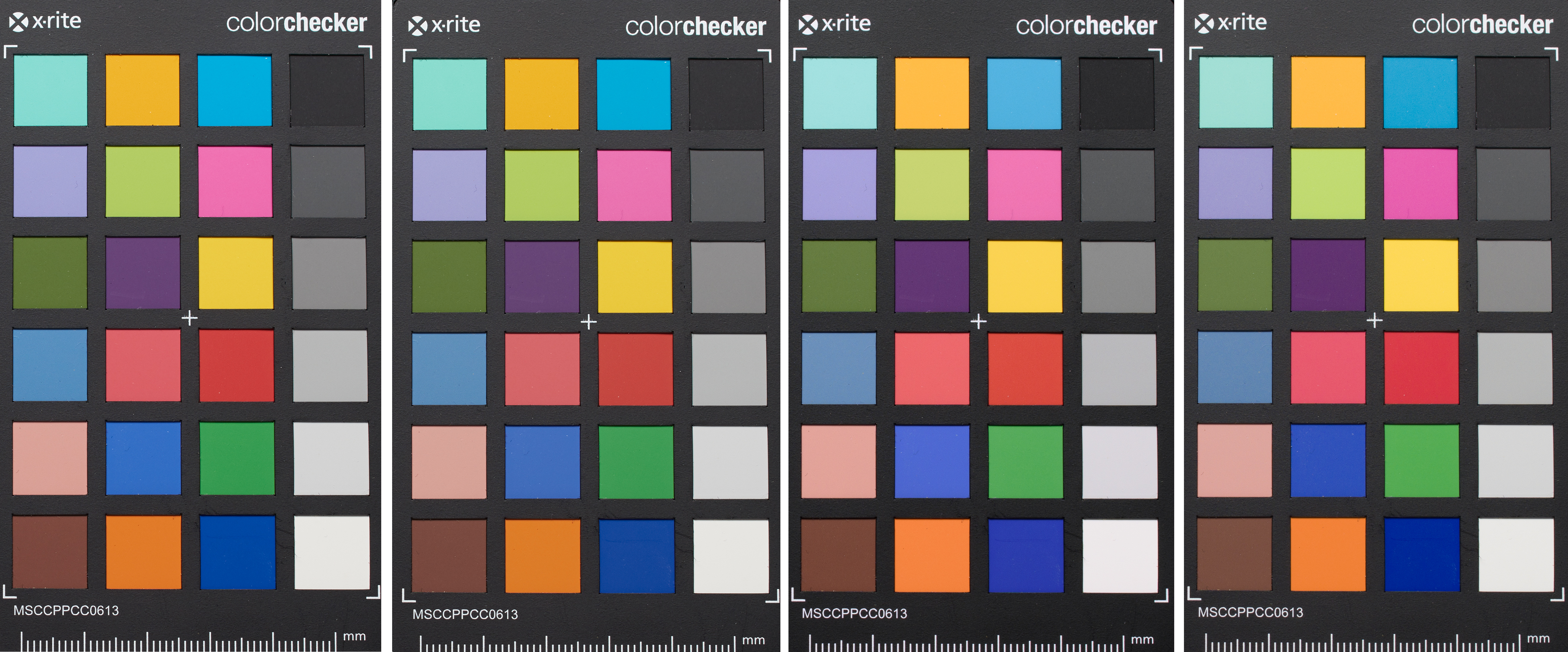
Capture One (from version 9) provides a “Luma” curve adjustment in addition to the classical RGB curve adjustment; the former allows changing contrast without effect on color hues and saturation. But the canned profiles of RAW converters already contain various subjective non-linear transformation (creative presets), very similar to the rendering of color films – for those who remember the response of Fujichrome Velvia versus, let’s say, Kodachrome 25. Some of these settings may, however, be more appropriate for arctic landscapes than Mexican cityscapes. The only way to gain insight into this internal RAW cooking, is to photograph a test target under controlled lighting conditions (5000 K – D50) and check the coordinates that each color patch corresponds to.
I had already bought the Xrite ColorChecker Passport chart, denoted CC24 from now on, which consists of a standard 24-patch (Macbeth) color target in a plastic case. Originally developed in 1976, it is still a good reference for camera profiling, thanks to the relatively saturated colors of a large spread. While glossy and semi-glossy targets (such as the ColorChecker Digital) contain higher-saturation colors on their patches and thus cover a larger color gamut, they also produce glare that is difficult to control. It is also important to note that the colors of the CC24 where changed slightly in 2014 due to compliance with stricter environmental laws. Mine was produced in 06.2013; its CIELAB (L*a*b*) color coordinates under a D50 illuminant can be found here.
As a standard D50 illuminant, I use the Just Normlicht ColorMaster, desktop viewer. This viewer not only serves the purpose of photographing the CC24 under calibrated lighting conditions but also as a viewing station for up to A2 prints. I had found that I often printed too dark for the viewing conditions in a private home; with the viewer, I now have a calibrated reference.
It is generally accepted that an image viewed under a D50 illuminant will look right in any condition because the eye will adjust to the overall (warmer or colder) lighting. The technical term here is “chromatic adaptation”. It would be better to know the reflectance spectra of the CC24 patches, but this requires a not-so-cheap spectrophotometer. A standard profiling run, using Argyll CMS for example, consist of matching the patches of the CC24 by minimizing the difference between the actual and reference coordinates by optimizing the 9 variables of a transformation matrix, supplemented by a lookup table accounting for the nonlinearities at the extreme ends. The dark blues, as well as monochromatic artificial lighting, must me muted to obtain a realistic look in accordance with the human color perception. This is why this level of adjustments is best left to the professionals.
The question is therefore how one can create custom settings (rather than-full fletched profiles) for Lightroom and CaptureOne that yield a more neutral starting point in the most common lighting situations.
We thus start by photographing the CC24 with a calibrated (D50) illuminant. The 24 patches are sufficient as it is more important to have a good reference images than a test target with more patches affected by vignetting, glare, and lens flare. The black patch can be used to monitor glare and the gray scale to check linearity. To this end, I would recommend to bracket some exposure in order to avoid a nonlinear tone mapping. The white patch should be at L* = 96.5% and the black one at 20.5%. Glare must be minimized by photographing the target in an otherwise dark room. Lens flare can be reduced by mounting the lens hood (as always) and placing the color checker into the center frame to reduce lens vignetting. In the RAW converter, the white balance can be set to the second brightest patch, which is the most neutral. Then process the images with the recommended profiles and linear tone curves and open in Photoshop. The L*a*b* coordinates can be displayed by changing to LAB in the Image/Mode/Lab Color.
DNG profiling in Lightroom
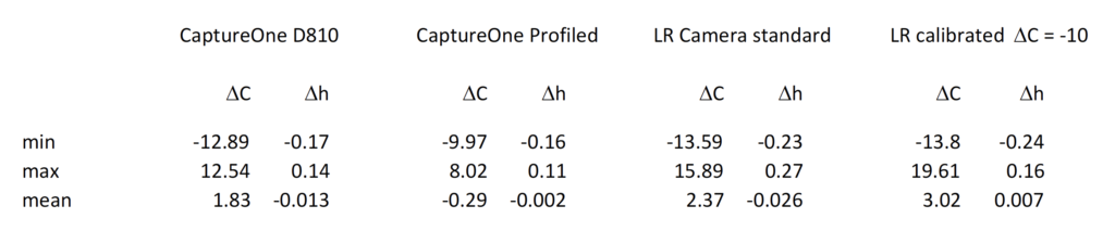
Using the CC24 and the corresponding Lightroom plugin from Xrite allows to create profiles directly in Lightroom. Adobe calls these DNG (Adobe’s Digital Negative format) profiles, but you don’t need to convert your RAW files to DNGs to use them. In Lightroom, select the imported image of the calibration target, then click the File/Export command and select the X-Rite preset. Name your DNG profile (something like D810-cal) and the software does all of the rest. After a restart of Lightroom, the resulting profile can be applied through the Profile pop-up in the Camera Calibration panel. Although the average hue shift is very low (see Table 1), the images become even more saturated. I had to dial in a global desaturation of -10 to arrive at something credible.
Profile adjustment in CaptureOne
Capture One has a “Color Editor” which is useful for making the typical adjustments you find in profiles. The best would be to use a linear optimization tool (for example the simplex algorithm) for adjusting the hue and saturation values to the reference output values. Unfortunately, there is no easy way to read out the L*a*b* values of the patches.
For individually tweaking colors it’s best to start with the relatively pure patches (green, red, blue, magenta, cyan, and yellow) because a saturation and hue adjustment on one patch has an impact on the other colors. And this is the reason why none of the profiles result in a perfect match for all the 18 color patches. To speed up this kind of iterative process it is better to calculate the cylindrical CIELCHab (L*C*h°) coordinates, where the C* stands for chroma (relative saturation) and h° for the hue angle. The lightness L* remains unchanged with respect to the CIELAB. The conversion of a* and b* to C* and h° is done with the transformation C = SQRT(a*² + b*²) and h°= arctan (b*/a*). This yields a better starting point for adjusting saturation and hue angle in the Color Editor widget of Capture One. When you are done click on the “…” at the top right of the widget and “save as ICC profile”; the profile can then be found in the folder Users/myuser/Library/Colorsync/Profiles. The result for the D810 are shown in the images and Table 1 below. The largest chroma shifts (oversaturation) are in the cyan while the lowest values are in the yellow. Unfortunately, quite some information is lost due to the sRGB conversion and jpeg compression. SR
* Well, Burano in the Venetian lagoon comes to mind as an exception.
** Their non-responsiveness and upgrade policy should perhaps be the subject of a future post.
Paul
8 Jun 2018You should give Lumariver a try!
http://www.lumariver.com
Stephan Russenschuck
14 Jun 2018Thanks for the link. Btw, the out of the box color rendition of the D850 files (processed with the standard profile of C1) is far more precise – the best I have seen so far.