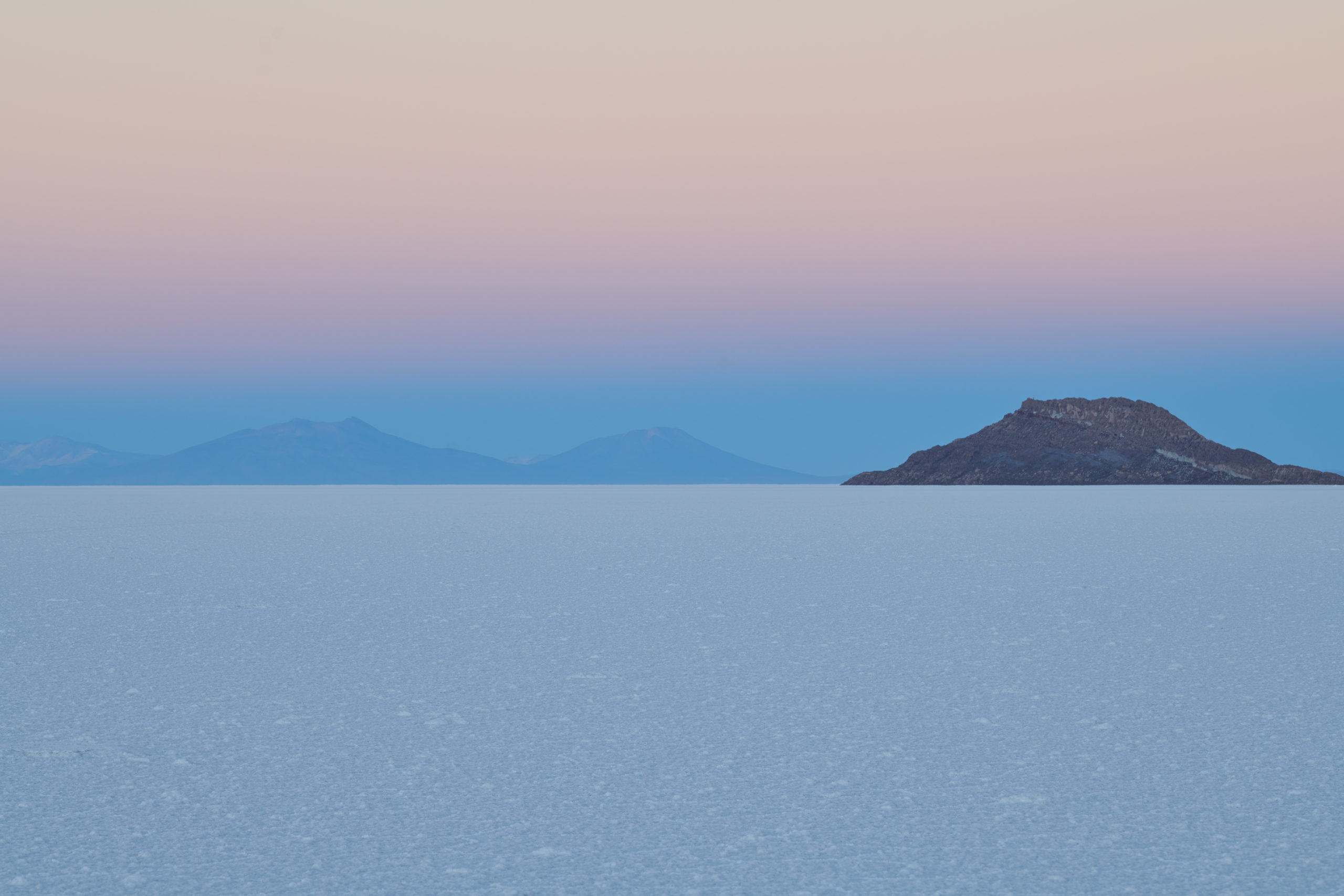
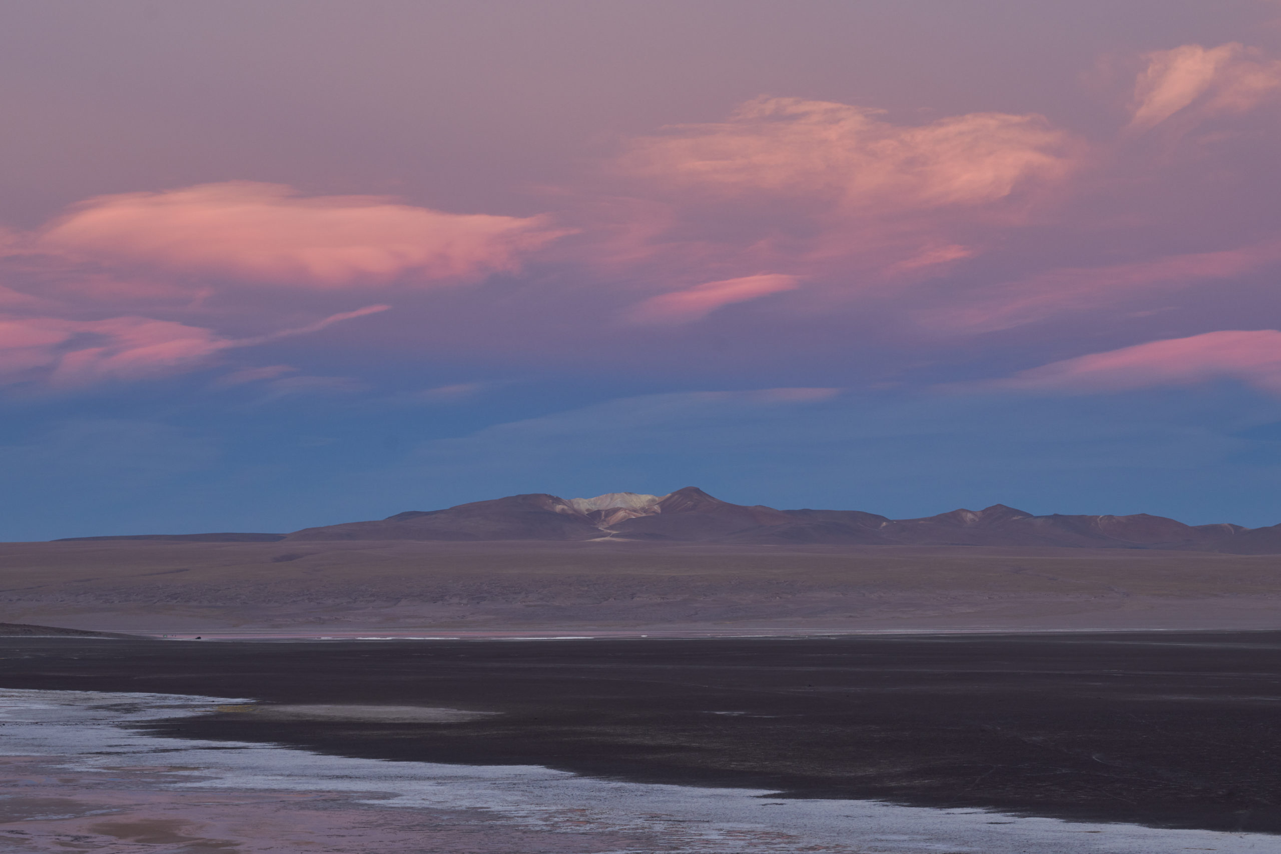
When the sun goes behind the clouds, many photographers pack away their cameras. But there is no bad light if only one finds a subject to match. Soft light is perfect for landscape photography during an overcast day or after sunset looking east (which implies shooting at “sunset point” in the morning*). Soft light is also beautiful for portraits, except perhaps for very rugged men.
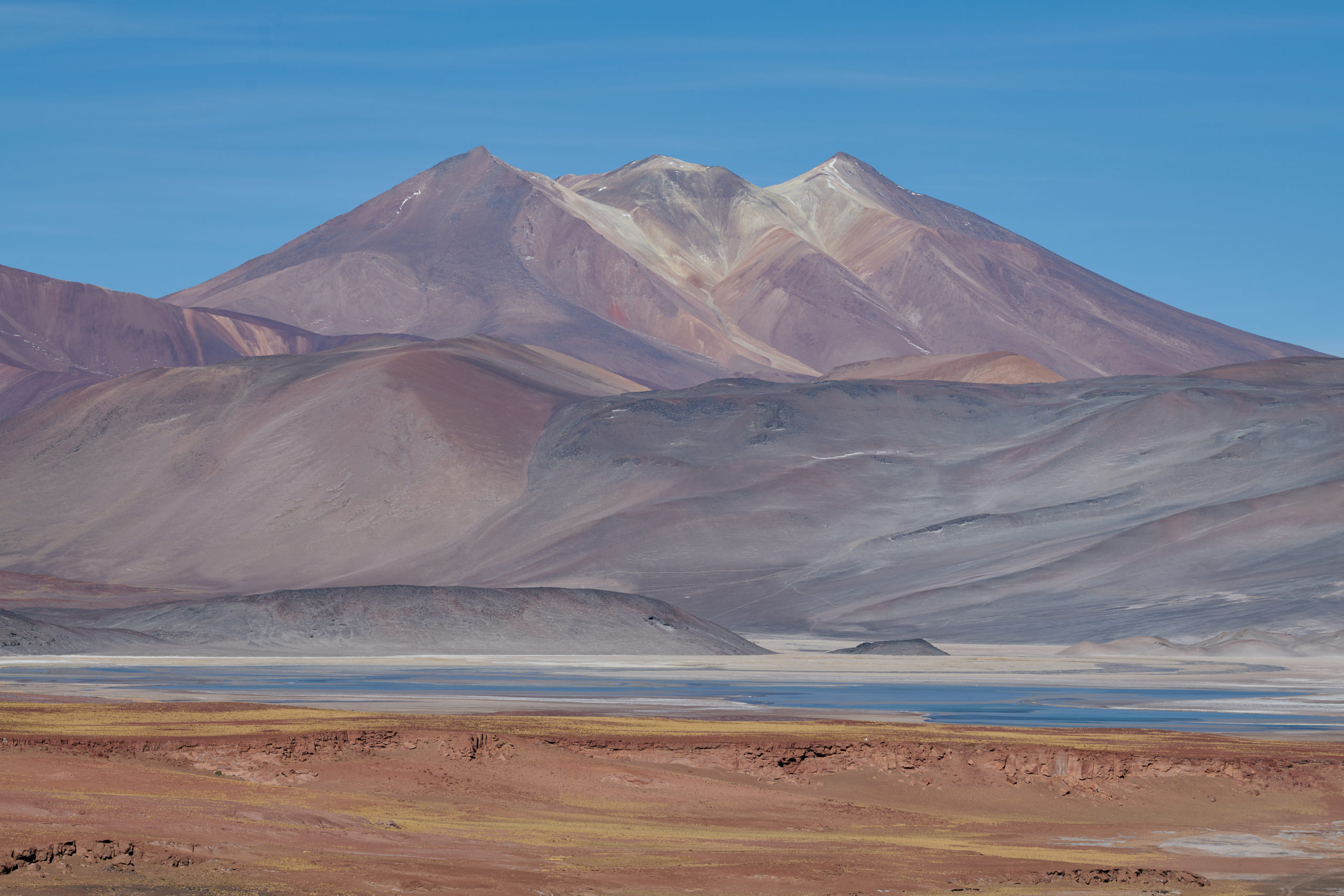
The barren landscape of the Altiplano presented another phenomenon: I had packed away the camera because the landscape looked very flat under the harsh afternoon sun. But because nothing could cast a shadow, the luminosity range remained very narrow.
I am pretty much a soft-light shooter, a habit born of decades of shooting slide film, which has about half the luminosity range of modern digital sensors. However, digital images with low contrast in both luminosity and color quickly look flat, particularly if they lack tonal separation, an area in which film excels.
Mid-tone-centric images are difficult to process. When changing contrast or brightness in the RAW processor, you might not want to affect the color contrast and saturation. But the RGB curve adjustment affects the colors, too. Brightening highlights and darkening shadows in the image also increase the saturation. Because of discontinuities in the mid-tones, this will quickly result in a processed look. With the “Luma” curve, available in Capture One Pro (version 9 and up), the contrast can be enhanced without affecting color contrast and saturation.
Still, these images are even worse to print. That a printed image may not resemble what you see on the screen is due to the brightness setting and the environmental illuminant. Relying on the histogram is not straightforward either, and this has to do with gamma correction. The standard reference for the mid-tones is the Kodak 18% gray card. Compared to a camera, human perception is far more sensitive to changes in dark tones than to changes in the highlights. When a RAW image is converted to a TIFF file, it is gamma-encoded so that twice the value in the file corresponds to what we perceive as twice as bright. This makes the most efficient use of a given bit depth.*** The gamma value is recorded in the color profile and embedded within the file. The file gamma is then automatically corrected by the monitor.
But when you edit an image in a RAW converter or in Photoshop, the RGB numbers are gamma-corrected. A correctly exposed image of the 18% gray card is shown near 50% (128) in the histogram, which may give the impression that this is at half the luma range of the output medium. However, it is still only 18%, and with no reference for setting the monitor brightness, mid-tone centric images often look too dark in print, even when viewed on the color-corrected light stand.
Printed on Canson Rag Photographique, the images in this post have a very painterly effect, almost watercolor-like. Mind you, I wasted some sheets and ink to get there. SR
*I have seen many photographers shooting right into the sun and leaving the scene after it has gone. But it is good to wait another 5 minutes and look east.
** The worst is to enable automatic monitor brightness or color-temperature adjustment (“night shift”).
***RAW files use a linear gamma. The RAW image viewers, except for the RAW digger, display images using a standard encoding gamma of 1/2.2, since otherwise they would appear too dark. The gamma value of 1/2.2 is also used when no color profile is embedded. The standard display gamma is thus 2.2 (V_disp = V_image^2.2), while older MACs use a display gamma of 1.8 that makes images that are not color-managed appear brighter.
Joao Pedro Assumpcao
21 May 2020Hi Stephan,
thanks for the subject and nice pictures. I agree pretty much with you, i.e., often shooting in low contrast situation may be much better than in strong sunshine light. I keep this from my France time (76-84) when I got used with TRI-X in often overcast days in Paris. When I went back to Brazil, it was hard to get used with our light here and I was quite desapointed with my shooting. Anyway, going back to your pictures I liked them quite much : simple, well composed, subtile and sending you a sense of calmness.
All the best, Joao Pedro