Tag Archives: ICC Profiles

The Colors of Mexico

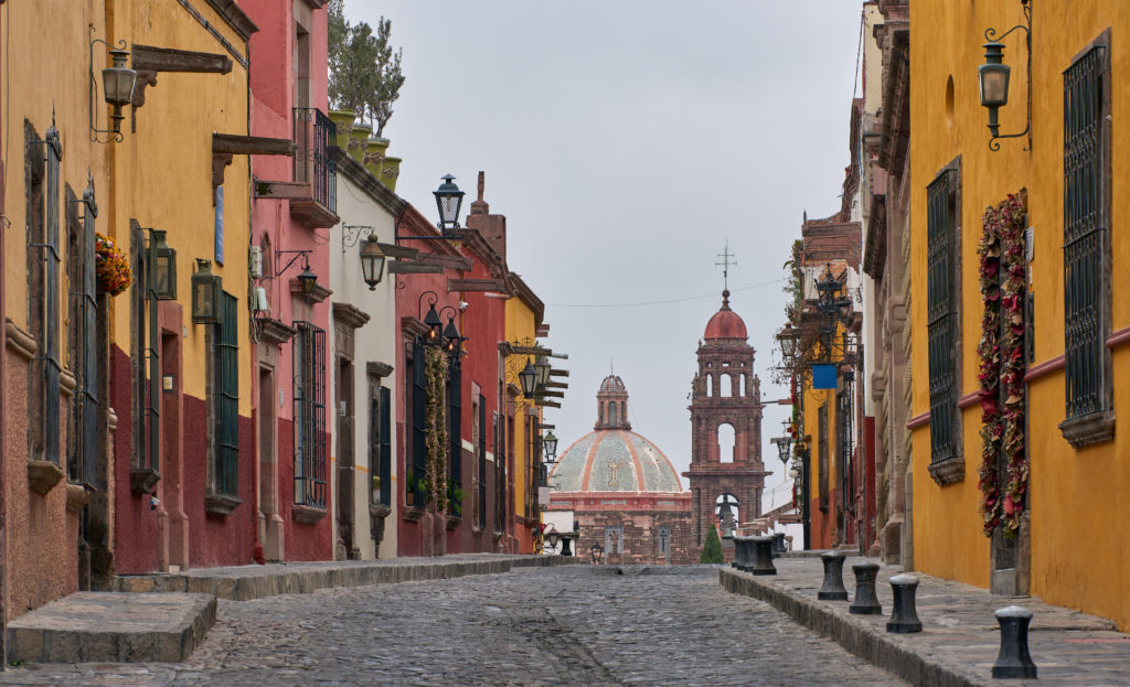
On a recent trip to the colonial cities around Mexico City and on the Yucatan peninsula, I was blown away by the colors in the cities and villages. In Europe, nobody would paint a house in saturated pink, blue, or orange, and in most places, this is even forbidden*.

Mexican culture, in general, is bursting with color, from vivid-colored textiles and folk art to buildings in a large color palette. But it wouldn’t fit if I simply posted some colorful images of a recent trip. There is almost always a technical aspect to discuss. This time, it’s the oversaturated colors due to wrong camera calibration and/or RAW converters serving the demand for vivid-looking images.

Continue reading »

Posted in Architecture, Image quality, Photoessays, Travel photography Also tagged , , |

Fine-Art Printing Diaries: Setting up

Look at images, not megapixels.

This series of posts will be on getting serious (I hope) about fine-art printing. In the film days I didn’t bother developing and printing myself; first I didn’t have the space for a darkroom and then I was reluctant to deal with the chemicals. But more importantly, there were plenty of overnight development labs in town and professional print makers that had a certain affinity to art. Color rendition wasn’t really an issue to discuss over a 4×5 slide on a color corrected light table. And I had a lot of prints done, as they were the only way to enjoy images, except perhaps for 6×6 slide projections.

Continue reading »

Posted in Equipment reviews, Fine art printing, Image quality Also tagged , , , |