Tag Archives: Color Management

Altiplano Watercolors

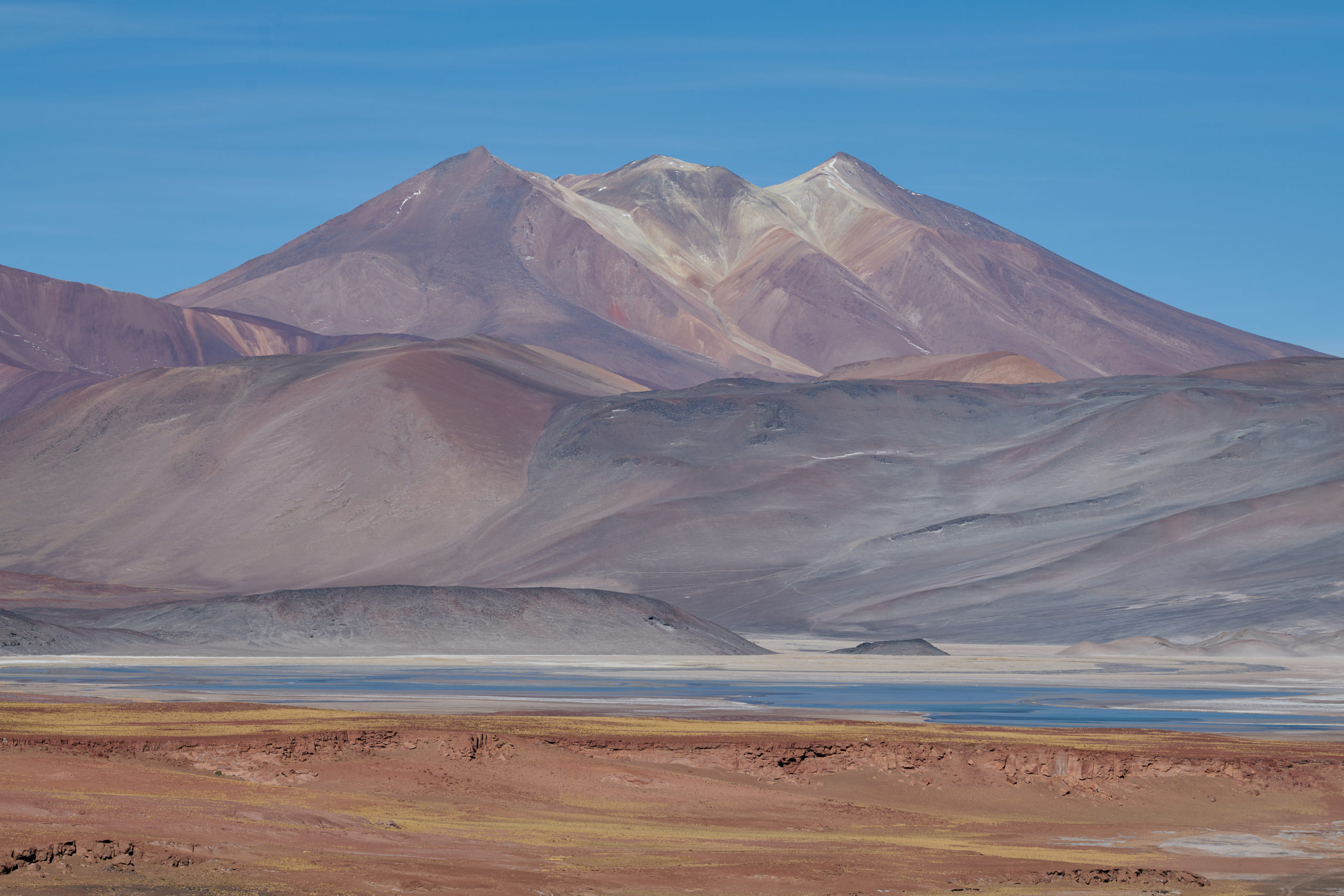
When the sun goes behind the clouds, many photographers pack away their cameras. But there is no bad light if only one finds a subject to match. Soft light is perfect for landscape photography during an overcast day or after sunset looking east (which implies shooting at “sunset point” in the morning*). Soft light is also beautiful for portraits, except perhaps for very rugged men.

Continue reading »

Posted in Image quality, Photoessays, Travel photography, Uncategorized Also tagged , , |

The Colors of Mexico

On a recent trip to the colonial cities around Mexico City and on the Yucatan peninsula, I was blown away by the colors in the cities and villages. In Europe, nobody would paint a house in saturated pink, blue, or orange, and in most places, this is even forbidden*.

Mexican culture, in general, is bursting with color, from vivid-colored textiles and folk art to buildings in a large color palette. But it wouldn’t fit if I simply posted some colorful images of a recent trip. There is almost always a technical aspect to discuss. This time, it’s the oversaturated colors due to wrong camera calibration and/or RAW converters serving the demand for vivid-looking images.

Continue reading »

Posted in Architecture, Image quality, Photoessays, Travel photography Also tagged , , |

The World Wide Web and Color Management: Assigned, not Converted

Sleep_conv

Image developed in Capture One Pro, saved as 16-bit tiff, down-sampled into 8-bit jpeg, and converted into the sRGB color space before upload.

Recently I had access to an Eizo ColorEdge CG 277, which is Eizo’s flagship monitor for highest standards of color accuracy and consistency. The monitor features a built-in calibration sensor and covers 99% of the Adobe RGB color space.

Although the monitor is able to achieve a 10 bit color depth (per channel), the entire chain was not, as I figured out using a test rampBut even though, the tiff images that I brought on a USB stick and opened in Photoshop CS6 simply popped out of the screen. This is the second-best thing next to a fine art print. It is clear that I must free some space in my home office.

But then I opened my web page in the Safari browser and was shocked. The images looked like kitsch*. On the contrary, the Safari browser on the MAC renders some of the images rather dull when compared to the tiffs opened in Photoshop. I had attributed this to the down sampling and heavy jpeg compression, but should have known better: most web-hosting services and web browsers do not support color management.

* Although I keep seeing such examples in magazines, a lake in Scotland photographed under a gray sky cannot look like the waters of Anse La Digue. And if it does in print, it’s kitsch.

Continue reading »

Posted in Image quality